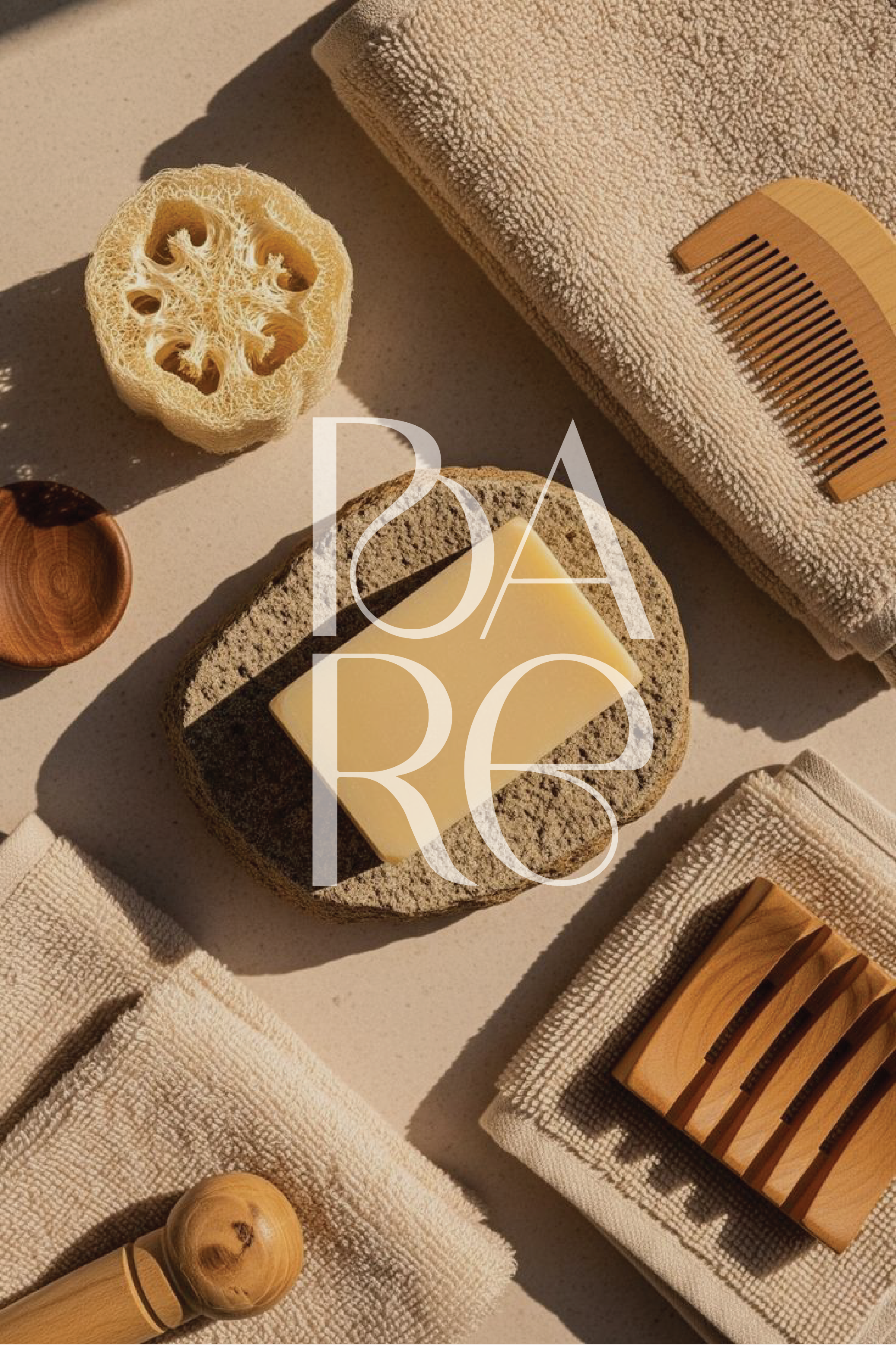
bare
background
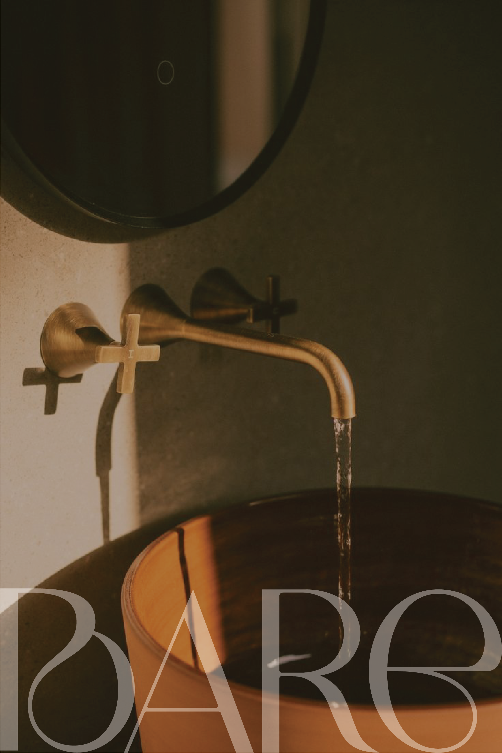
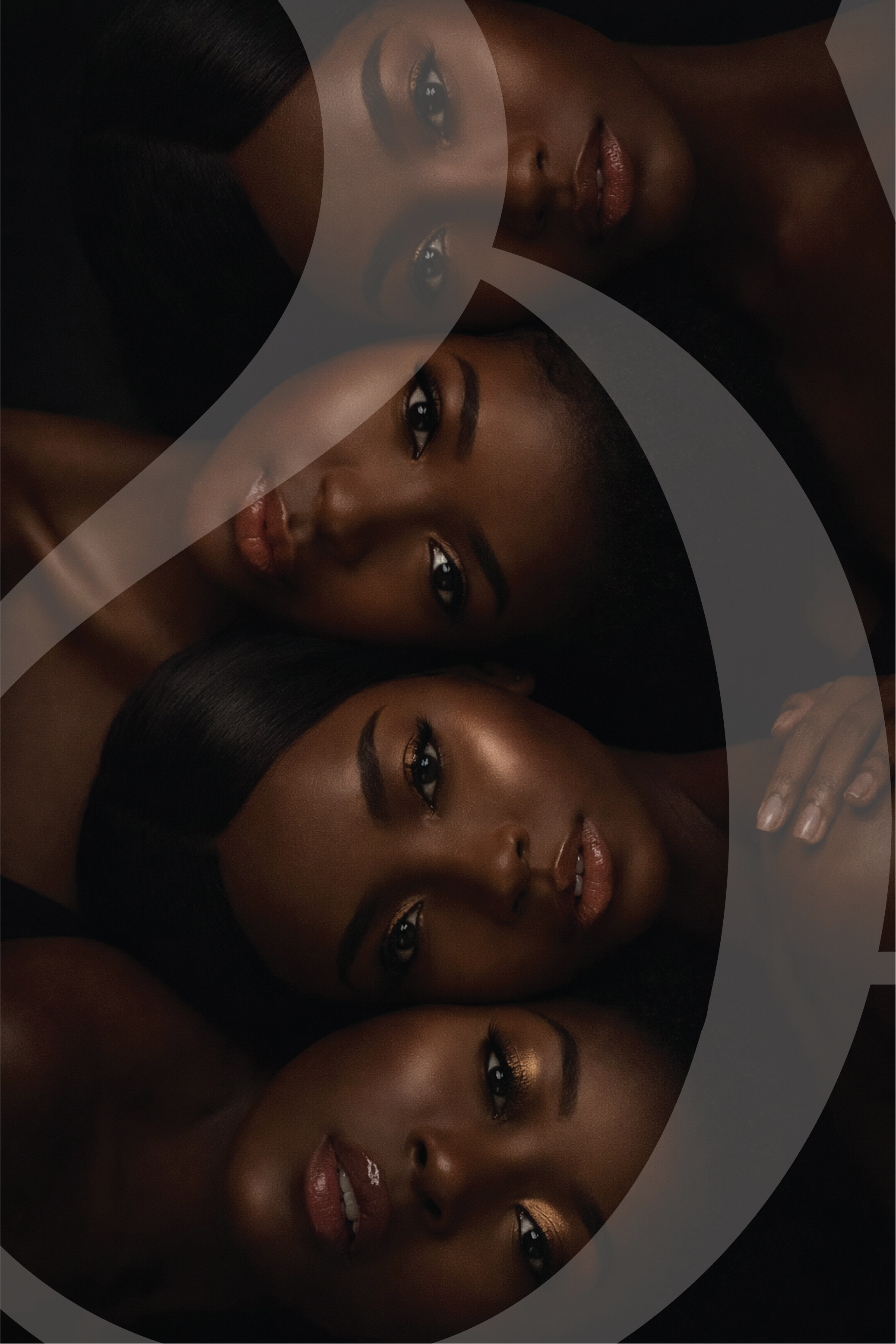
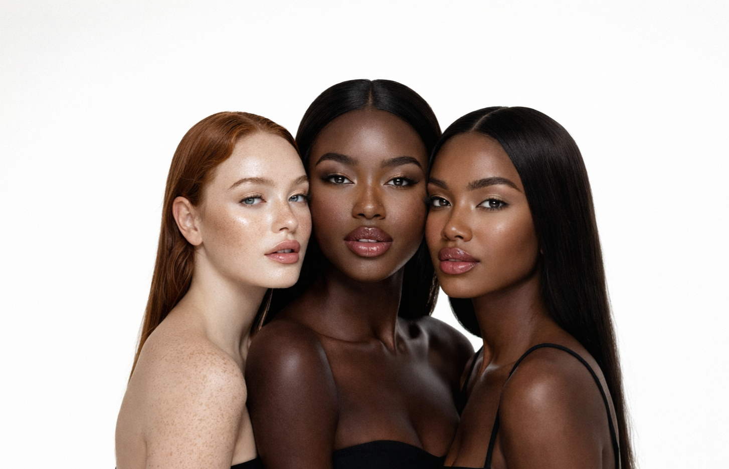
Bare is a soap brand designed to make skin feel soft, hydrated, and healthy—through a calm, minimal, luxury experience that feels like an everyday reset.
CLIENT:
bare
INDUSTRY:
beauty & personal care
SERVICES:
logo design
CHALLENGE
Create a brand that feels minimal, sophisticated, and calming, while still having a subtle visual signature that makes it memorable.
SOLUTION
A soft, refined identity with clean typography, gentle curves, and a natural palette that communicates calm confidence.
APPROACH
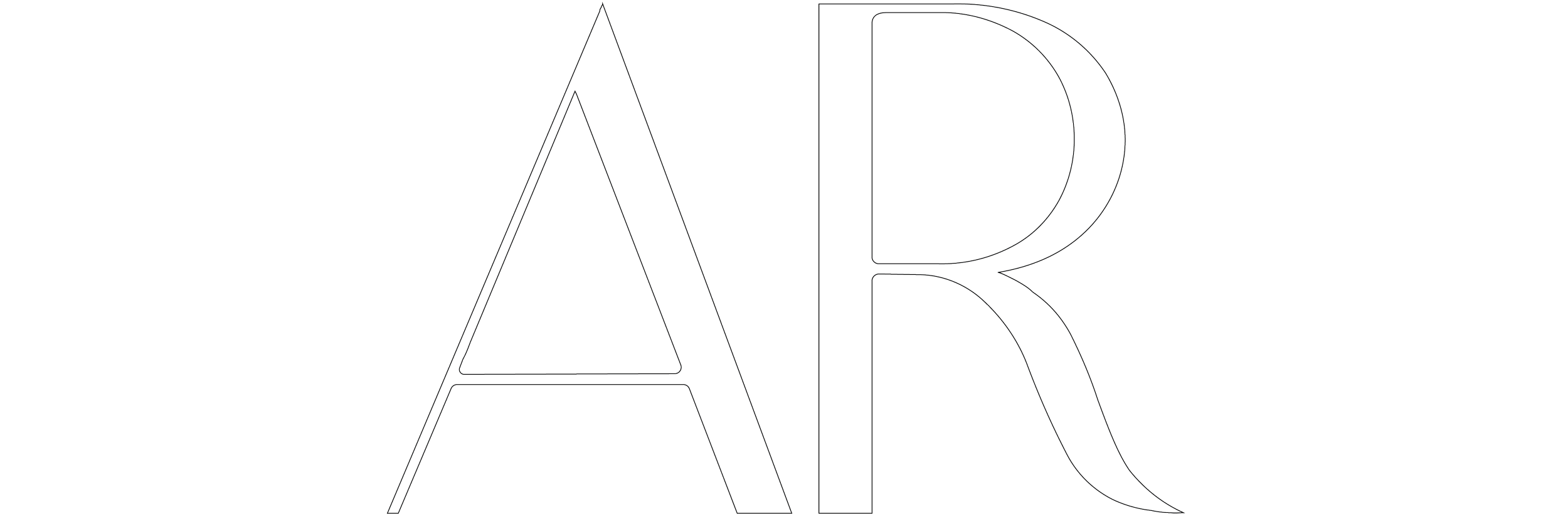
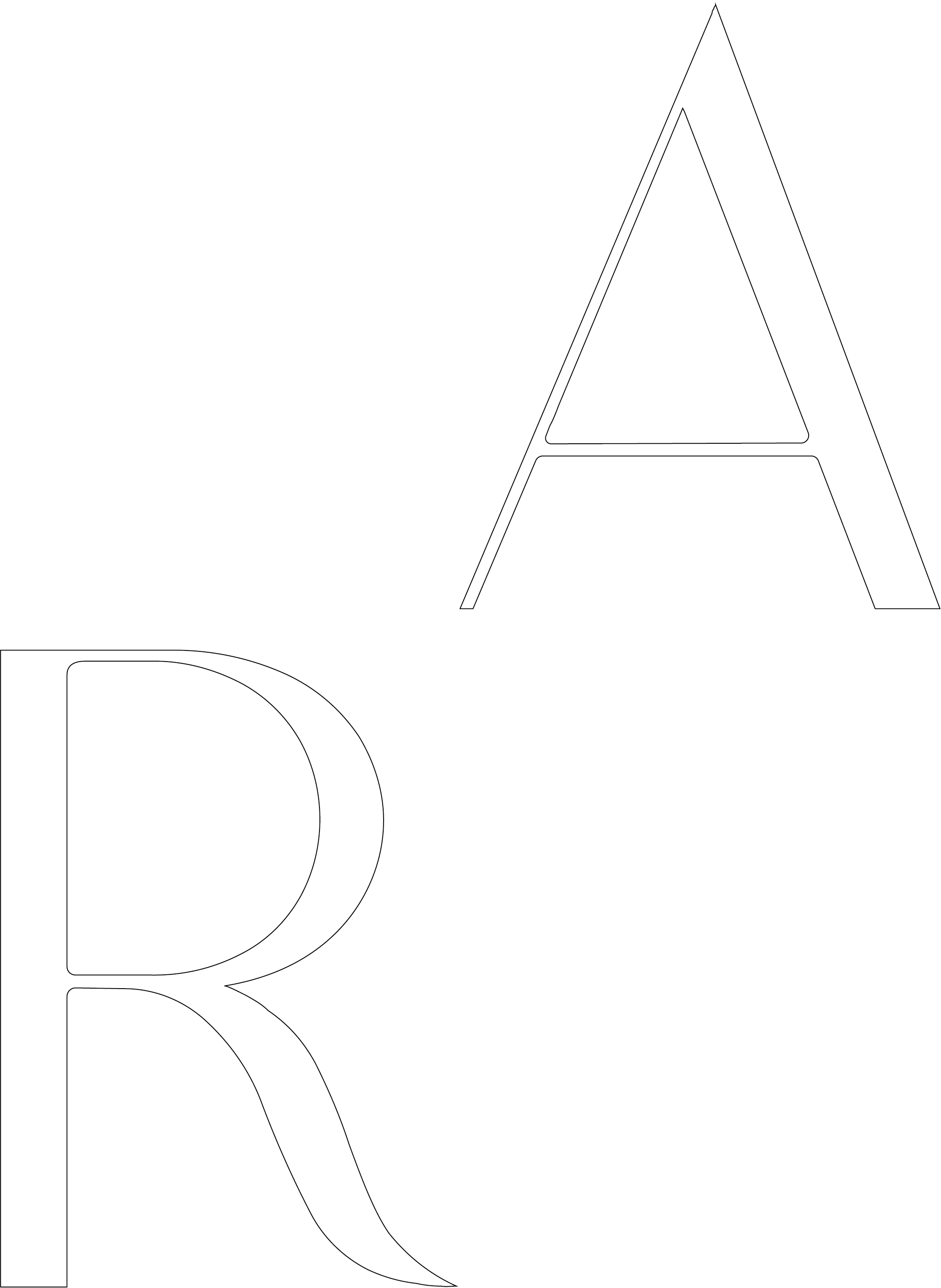
I designed Bare with quiet luxury as the foundation. I chose a clean sans serif to maintain minimalism, then introduced subtle curves in the typography to add a small flare of personality—proof that minimal doesn’t have to be boring. The color palette is soft and calming with sage greens, tans, and whites, creating a natural, hydrated, spa-like tone across the brand system.
LOGOS