norish & Root
background
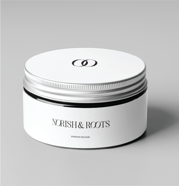
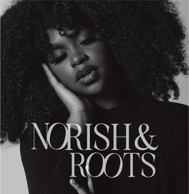
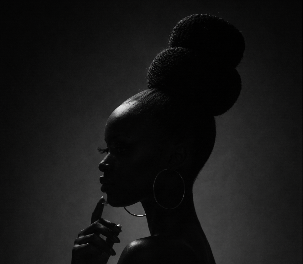
Nourish & Root is a haircare brand created to support Black natural hair through products that feel nourishing, intentional, and rooted in healthy routines. The brand needed to feel calming and elevated—like luxury self-care you can trust.
CLIENT:
NORISH & ROOT
INDUSTRY:
BEAUTY
SERVICES:
LOGO DESIGN
CHALLENGE
Create a visual identity that feels calm luxury and sophisticated, while still bringing in a subtle sense of personality and warmth.
SOLUTION
A refined brand system built on clean typography, subtle playfulness, and a neutral palette that feels timeless, premium, and rooted in care.
APPROACH
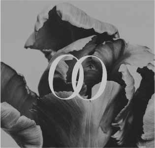
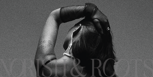
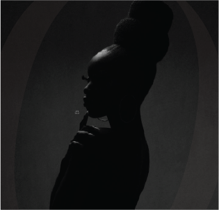
I designed Nourish & Root to feel quiet luxury with a soft edge. I chose a serif font to reinforce sophistication, then added a hint of playfulness by italicizing and adjusting the shaping of the “O’s” to create a unique, thoughtful detail. The color palette stays minimal and elevated with black, white, and layered greys to keep the look calm, modern, and luxurious.
LOGOS