urban grind
background
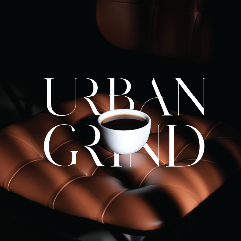
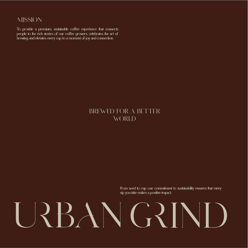
Urban Grind is a premium coffee brand bringing authentic, made-from-scratch coffee to the city—crafted fresh daily with care, quality, and intention.
CLIENT:
URBAN GRIND
INDUSTRY:
FOOD & BEVERAGE
SERVICES:
BRAND IDENTITY
CHALLENGE
Capture a brand that feels rich and high-end, while also communicating an earthy, sustainable, handcraftedexperience.
SOLUTION
A bold, premium identity paired with deep earthy tones and balanced neutrals—creating a brand that feels elevated, grounded, and city-ready.
APPROACH
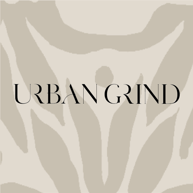
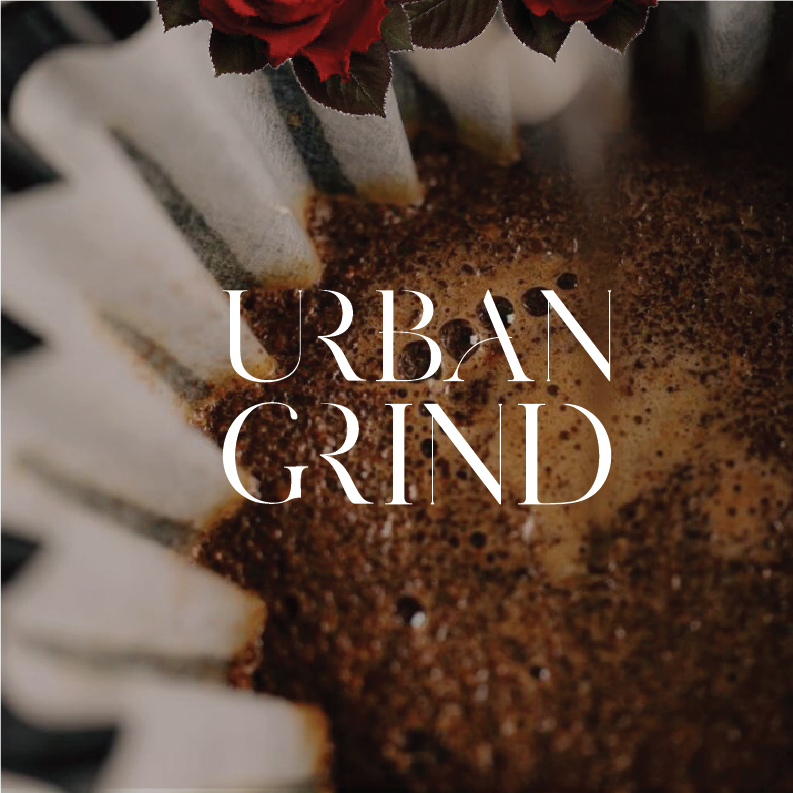
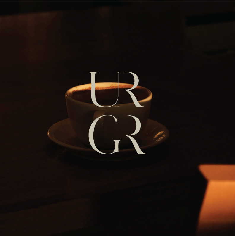
I approached Urban Grind with a focus on premium richness and authenticity. The color palette includes deep tones like burgundy and sage-inspired greens to reflect earthy freshness, with black and white to add balance and structure. For the logo, I kept typography sophisticated but added uniqueness through subtle contrast in stroke thickness and intentional letter details—especially the “A”—to make the mark feel custom without losing its luxury tone.
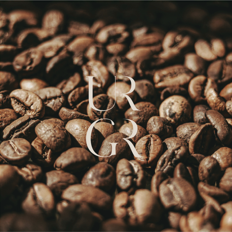
LOGOS


COLOR PALETTE


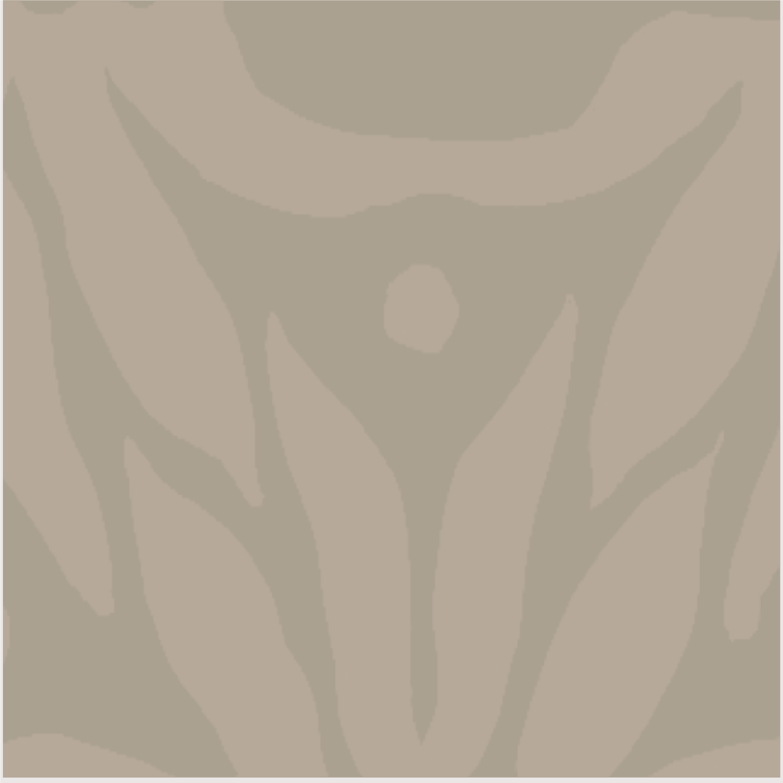
BRAND PATTERN